
Sam’s Club - Digital Rebrand
Project Overview
At the beginning of our 2+ year engagement with Sam’s Club, they were in the midst of a total brand refresh, including a new logo and a modernized look & feel. While branding guidelines were clearly defined for print collateral, there was no framework on the digital side. The goal of our project was to extend the rebrand across Sam’s Club’s “member-facing” website and digital touchpoints.
My Role
UI/UX, Visual Design
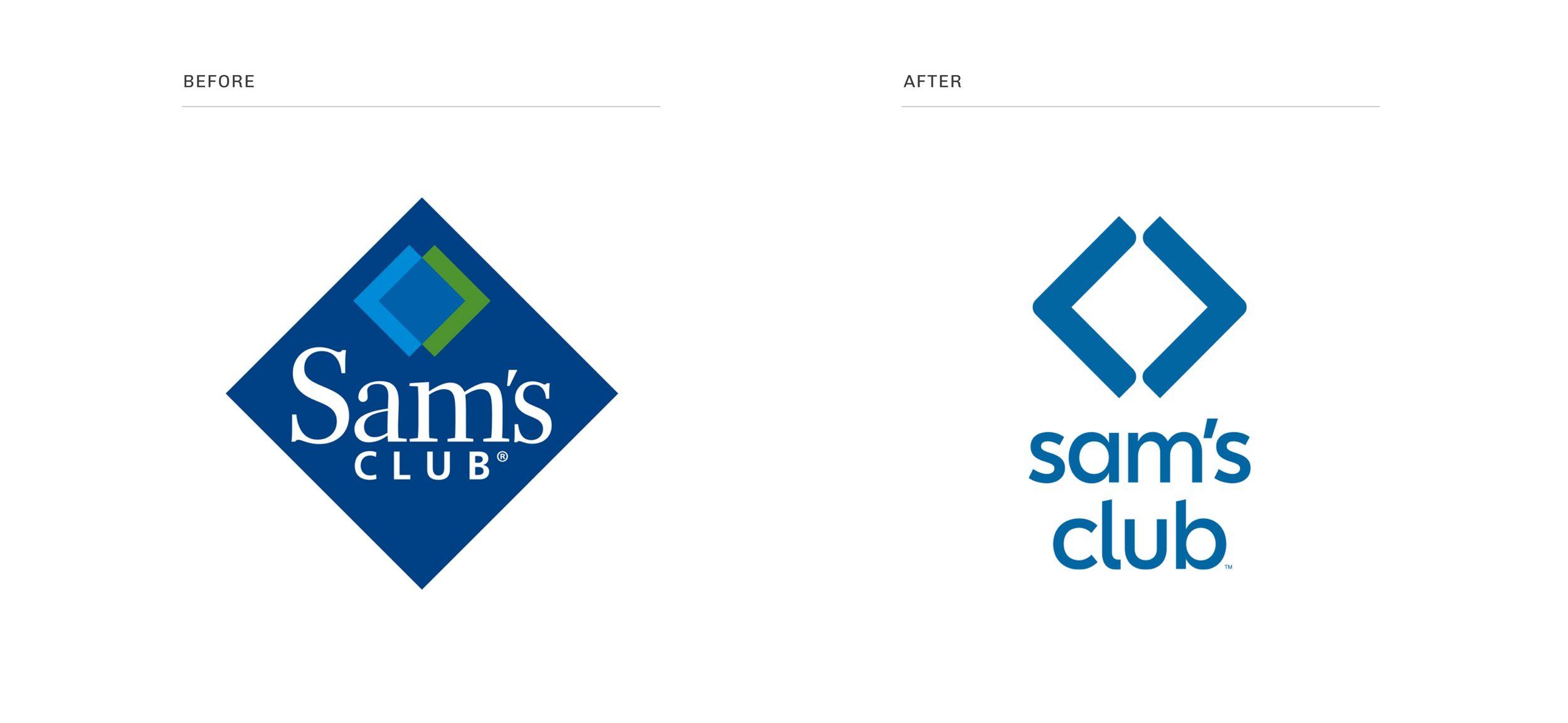
Brand Update
The updated logo and branding guidelines served as our primary source of inspiration. The new brand had a focus on clean, simple lines and ample white space, characteristics which we would carry into our visual design explorations.
Design Language System
We defined an extensive Design Language System (DLS) which would be used across all member-facing digital touchpoints. We worked closely with the design team at Sam’s Club to ensure that the proper components, styles, and states were included. We provided ample documentation, to ensure that all designs, both present and future, would have a consistent look & feel.


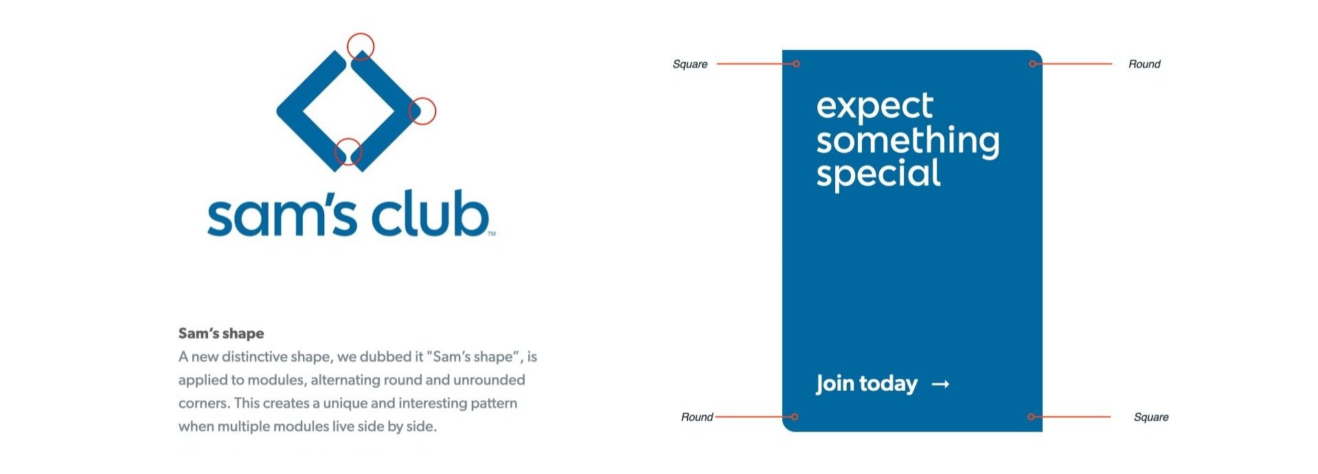
We experimented with “branded moments” that would extend the visual language and add a touch of individuality to the UI. One example of this is “Sam’s Shape”, a unique card design that intentionally mixes round and sharp corners, mimicking the treatment of the new logo.
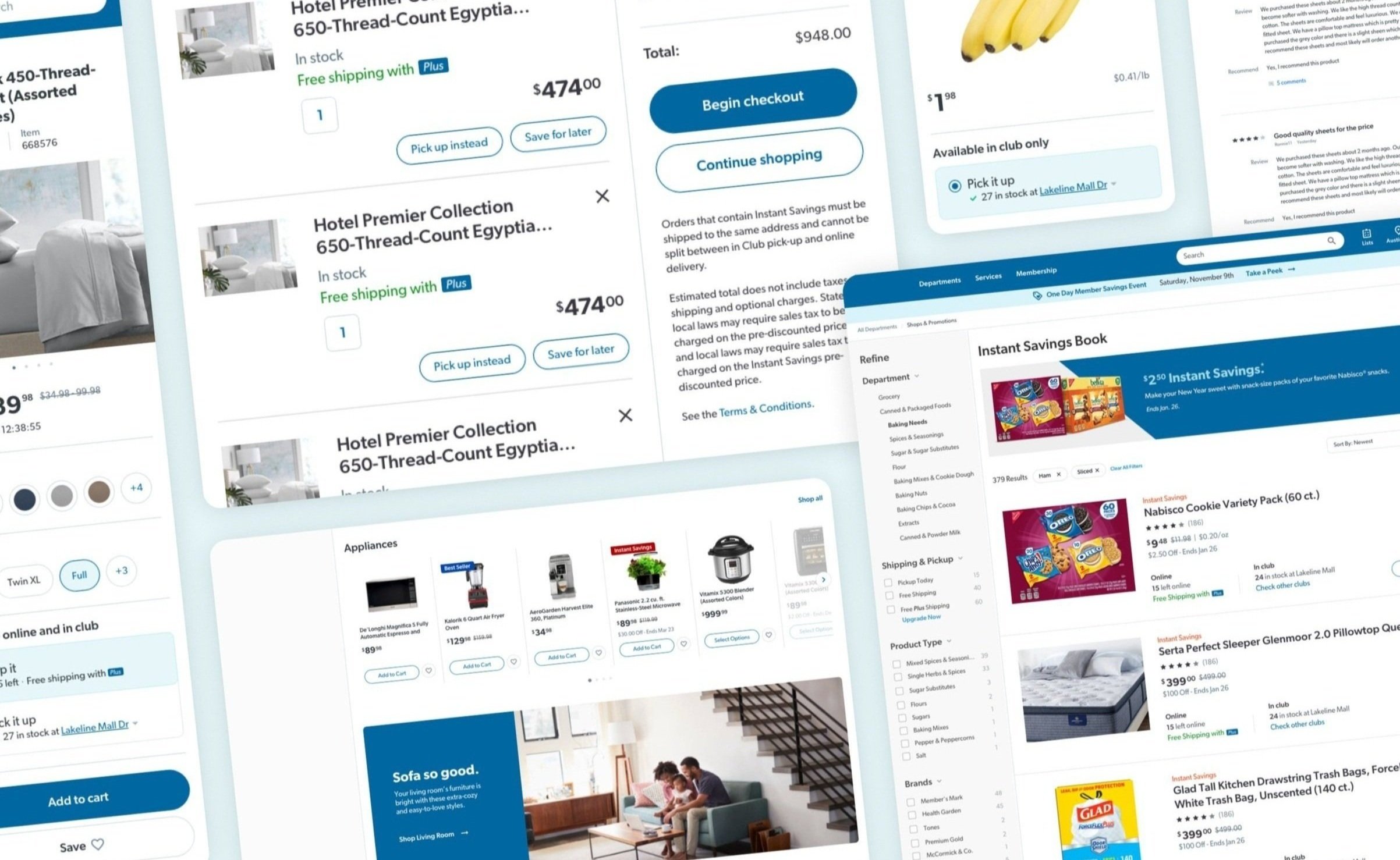
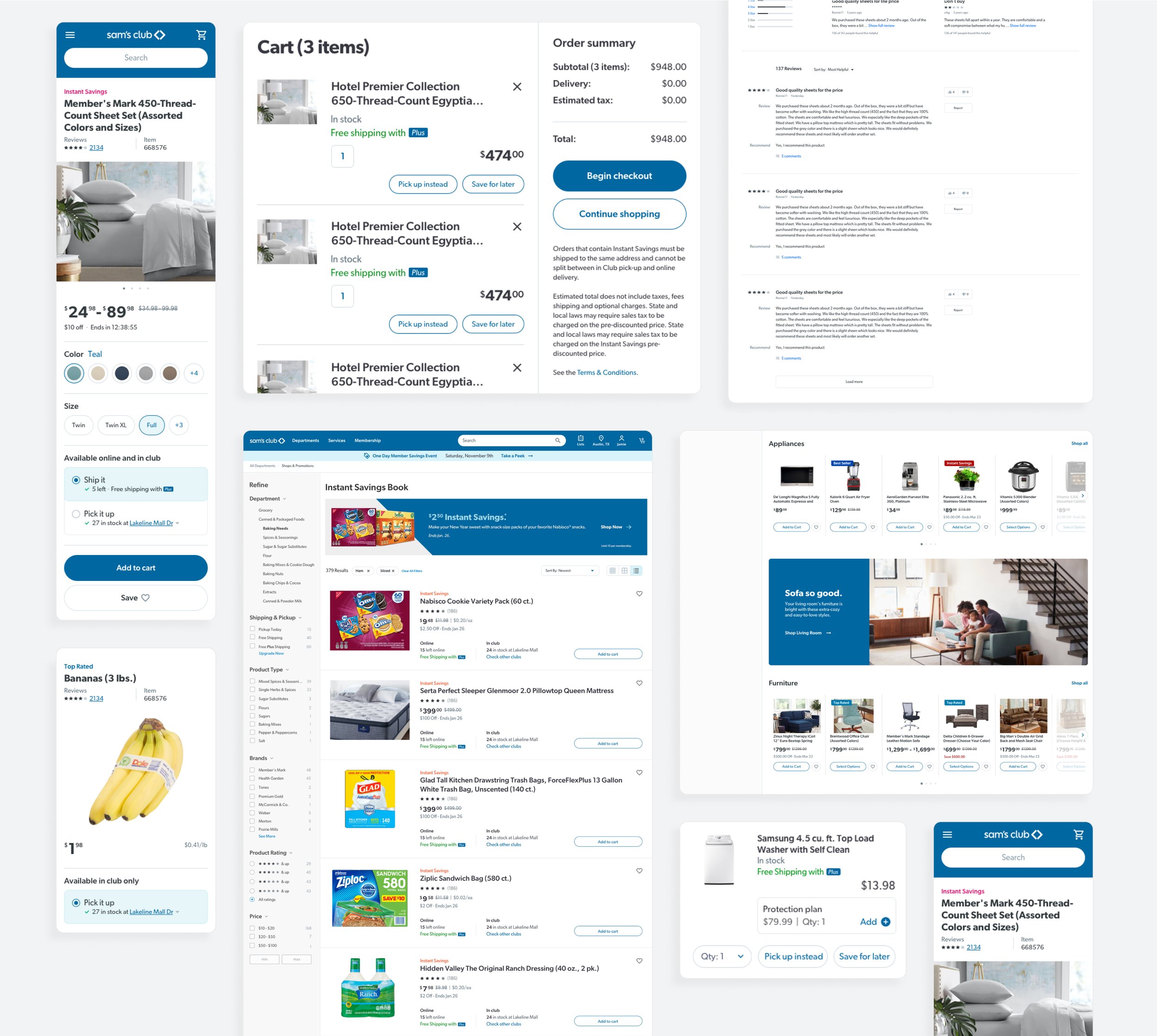
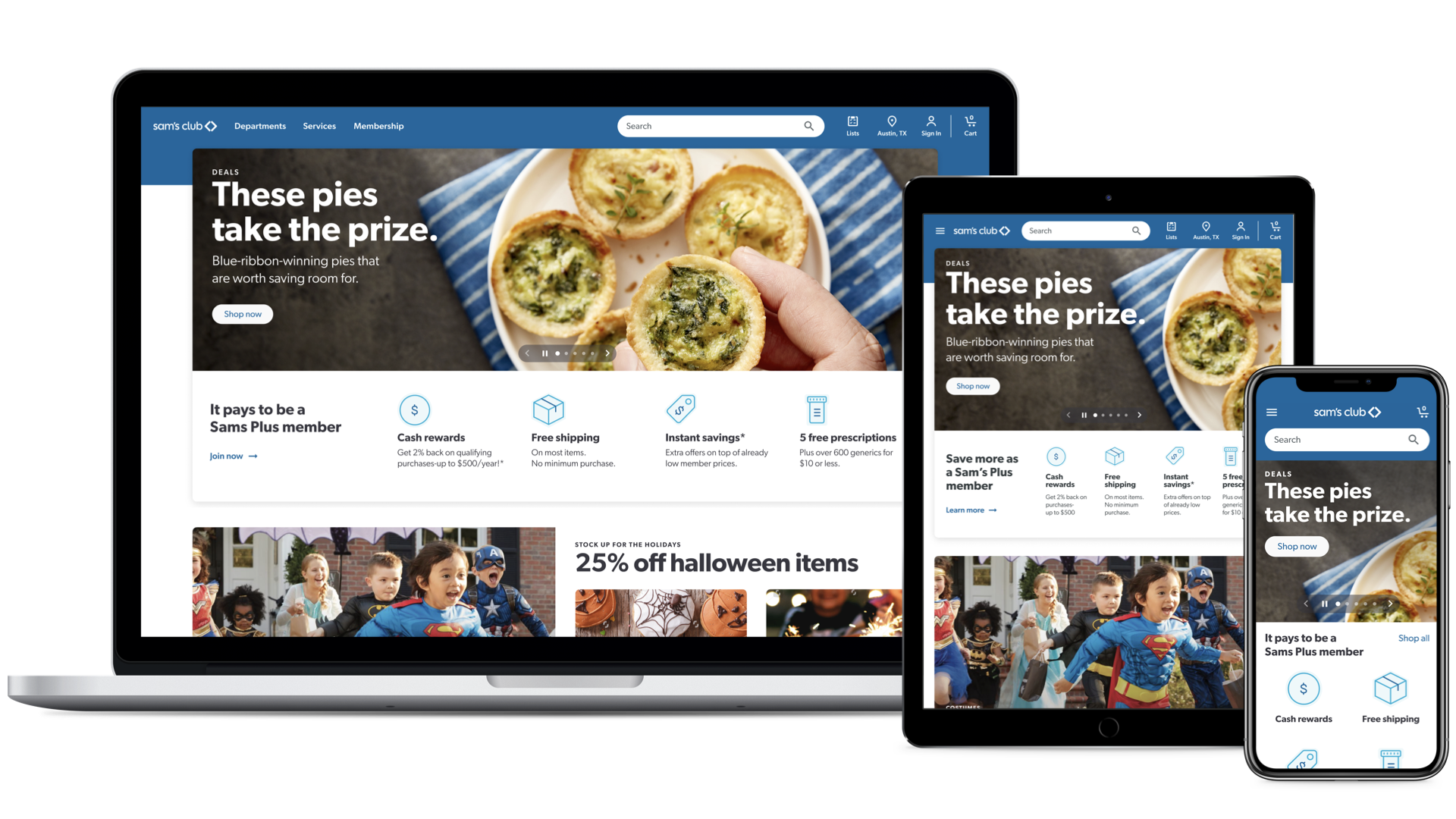
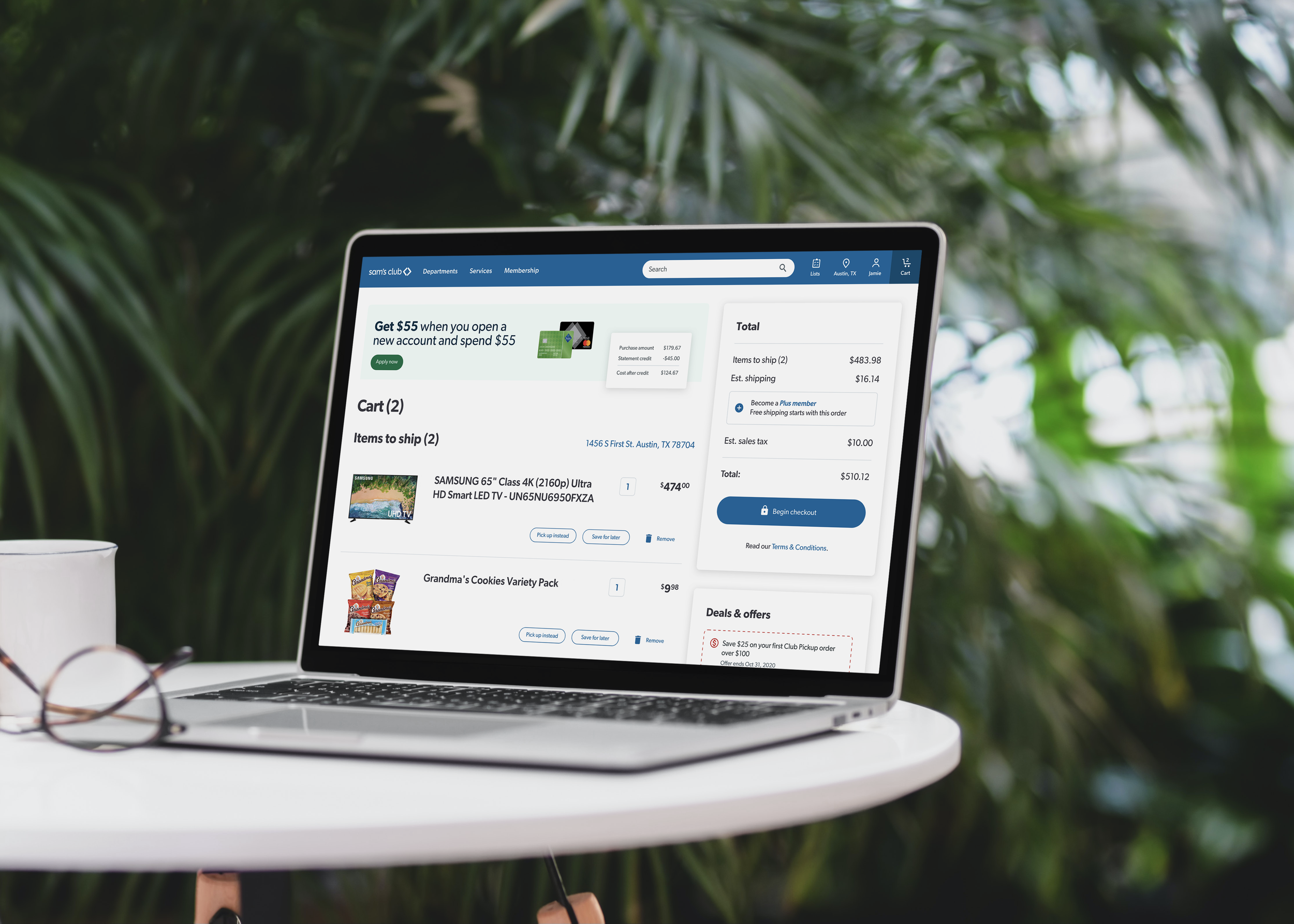
Website Design
We used the new DLS to update the design of Sam’s Club’s core website pages. We focused on the Homepage, Product Detail Page (PDP), Product Listing Page (PLP), and Cart.
In addition to updating the overall look & feel, we also presented concepts for UX enhancements. The focus was on intelligence and customization, with different ways to tailor the experience for users, depending on their location and membership status.
Created at argodesign